overview
what
Imagining America was launched in 1999 as a reaction to arts, design, and humanities being underrepresented and values of reciprocity and mutual benefit going unrealized. After 20 years, the organization decided it was time for a new graphic identity.
Previous logo used from 1999-2019
team + my role
This project was completed with 4 other teammates: Katherine Lin, Jamie Oka, Rokaya Shenasa, and Margot Uchicua, under the guidance of Professors Brett Snyder and Glenda Drew. The project was extremely collaborative— my main responsibilities included assisting with research, logo development, and graphic strategy.
From left to right: Jamie Oka, Pattie Chen, Rokaya Shenasa, Brett Snyder, Margot Uchicua
background + research
imagining america
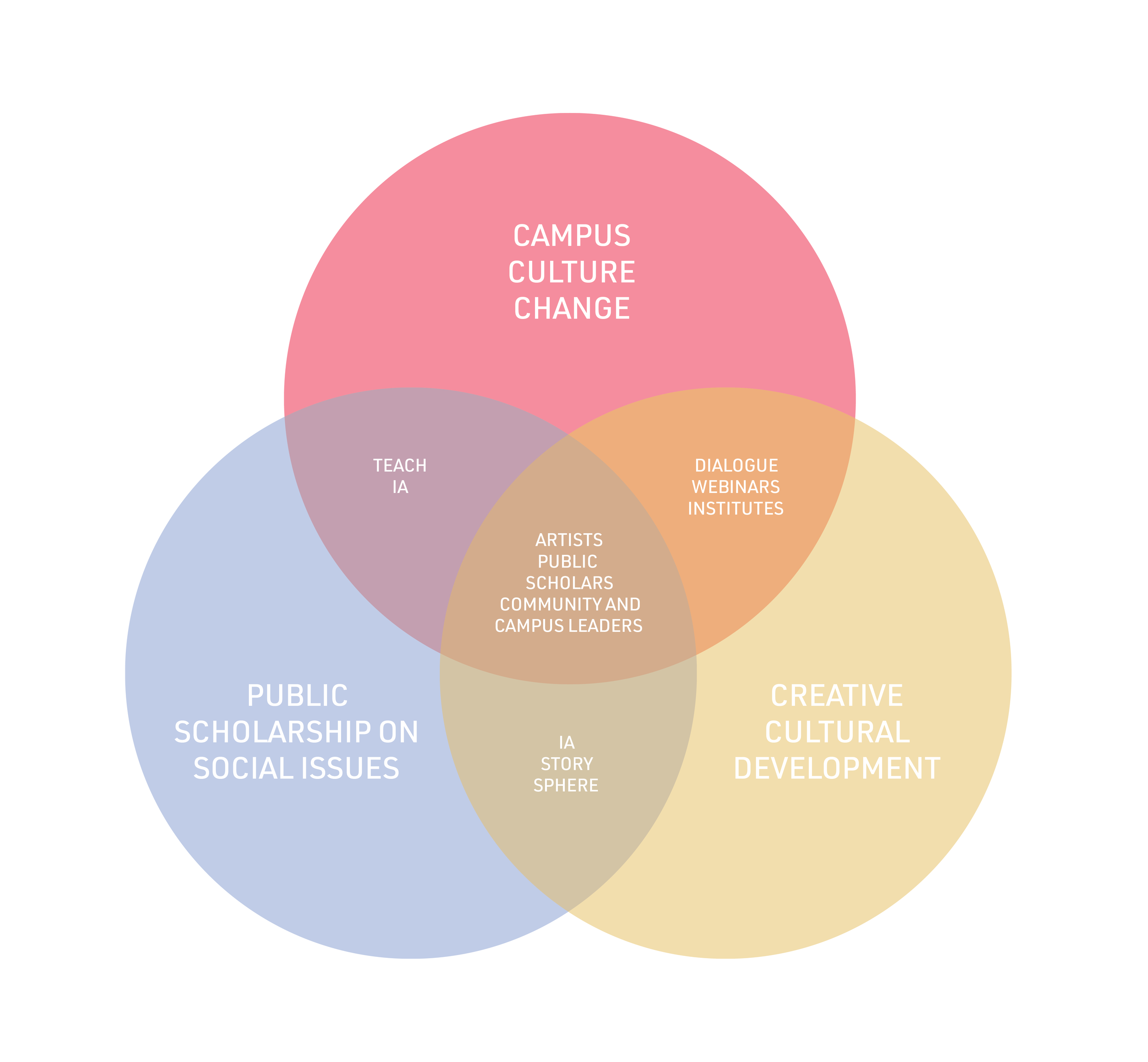
Imagining America describes themselves as “a non-profit organization that brings together scholars, artists, designers, humanists, and organizers to imagine, study, and enact a more just and liberatory ‘America’ and world. Working across institutional, disciplinary, and community divides, IA strengthens and promotes public scholarship, cultural organizing, and campus change that inspires collective imagination, knowledge-making, and civic action on pressing public issues.”
research
We researched IA’s peer organizations to visualize their graphic strategies and help us better idealize how we wanted to establish IA’s new graphic identity.
development
logo iterations
The logo development process was extremely iterative and collaborative. We would brainstorm and sketch a few ideas every week and share them with each other during our weekly meetings. From there, we would select the ones we found promising and hand off our sketches to another teammate to digitize them, after, the sketches would go to a different teammate who would then make their own adjustments. This process continued for many months— we would check in with the IA team periodically to receive and integrate their feedback.
final logo + graphic standard
logo concept
After almost a year of research and development, the logo that we decided on was the perfect fit for Imagining America. Imagination is so deeply ingrained in America that it has become a part of it and the two cannot be separated, resulting in the idea that the i and the a are one. America is represented by the lowercase a, completed with the lowercase i that represents imagining. The logo’s physical qualities have a dimensional and handmade feel to it, as if it was created by a brush, alluding to IA’s commitment to the arts . We created 3 variations of the logo: the logo mark, the logo and title, and the full lockup with the tagline.
colors
For the color palette, we didn’t want to choose colors that would appear too “patriotic.” By providing many secondary and tertiary colors, we were able to create a unique color palette that offered a variety of color combinations.
The primary logo is a bright red with a hint of pink. The Imagining America team felt that it was important to maintain some of their previous identity by keeping the logo red. We wanted to refresh the color with a pop, making it warmer and brighter. By adding a touch of pink, the red became more welcoming and unique to the organization.
Marketing + Promotional Materials


